Of all the many shams of our many-shammed (and shamed) era, perhaps the one that annoys me most of all is most often captured and filed under the notion of "usability." As someone who is rapidly approaching 65-years-of-age, I'll admit that I spent about the first 50 years of my life never really considering the idea of usability. Then, like a burst of explosive diarrhea, at once, proponents of usability are everywhere and a whole battery of usability people, a veritable profession has grown up around the misnomer.
The problem for me is today, everything is harder to use than it's ever been. What's more, everything you do use extracts more time, information or effort from the user. All so the company behind the canard of usability can squeeze every last sou from your dual authenticated bank account.
There are so many examples I can give of bad usability. And so few of good usability.
Sure, there's an experimenter bias in usability. You're likely not to notice how smoothly something functions when it's usable. And you're likely to be irked by things, especially simple things, when they defy ease, logic and any normal-human level of patience.
Yes, I'm pissed this morning.
I'm traveling through one of the least usable of all human inventions: the airport of a major metropolitan area. Having no carts makes a large airport unusable--especially since the derelict exertions of the airline industry mean you can't rely on getting your bag if you check your bag. Neither function is usable. The checking or the arriving. So you carry on.
But of course, there are no carts. The overhead bins are has-beens. Even in so-called business class, which is called that presumably because the airlines give you the 'business.' In the parlance of the old Bronx, they roll you like a drunk in a gutter and shiv you if you complain.
Let me start earlier regarding usability.
Let's start with something I used to take for granted.
A menu.
A menu on a piece of paper or a few sheets of scrap. Or a chalkboard.
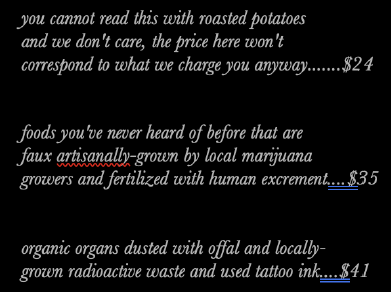
Now, you get a QR code. And have to look at the menu on the phone and pay with your data for the right to order a hamburger. Plus, the type size on a phone screen is about six-point. And most designers of websites don't have the usability courtesy to choose thick, sans serif typefaces. So you can barely read the menu without pinching and scrolling and almost invariably getting redirected to a site that will "freeze away" your body fat.
The plague of bad usability is almost everywhere. In our expensive hotel room, neither my wife nor I could figure out how to turn on or off the lights. There were more switches inside the room lit by tiny green LEDs and toggles and buttons, but we couldn't get the lights on or off. Everything is more complicated than a WW1-era German e-boat.
Both my wife and I have advanced university degrees in advanced university subjects. Throwing a switch up for on and down for off is no longer, somehow, acceptable. Turning a crevassed knob right or left for on or off is passe.
It actually gets worse in the shower.
When the hotel gives you little bottles of unguents, I need those bottles to tell me one thing. What's inside? Is it shampoo? Conditioner? Bath gel? Body lotion (what else would you lotion? the furniture?) Again, like the QRenu above I can see nothing that tells me anything. What’s more, I don’t need a brand story on my lavender verbena nostril cleanse.
In fact, every "experience" the world subjects me to seems bent on robbing from me that last remaining trace I have of being a human being.
When Vincent Sculley--not the baseball announcer but the Yale scholar called by Nazi-sympathizer Philip Johnson,"the most influential architectural teacher ever" wrote on the destruction of New York's grand Penn Station for the veritable money-maximizing shithole that replaced it, he said, [Once] one entered the city like a god. One scuttles in now like a rat."
A lot of what I do now in what might be the final dogged cataclysm of a life of feline failures is tell clients something really simple.
People like brands for the same reason they like people.
We like people who treat us with kindness.
We like people who respect us.
We like people who do what they say they're going to do.
We like people who are funny and fair.
All that is missing in my brands, including agency brands, in the world today. Even the notion that we should treat people well--not as "revenue to be maximized," is essentially alien.
So, from a usability-of-living POV, we now all scuttle about like rats.
Rats carrying too much luggage.

No comments:
Post a Comment