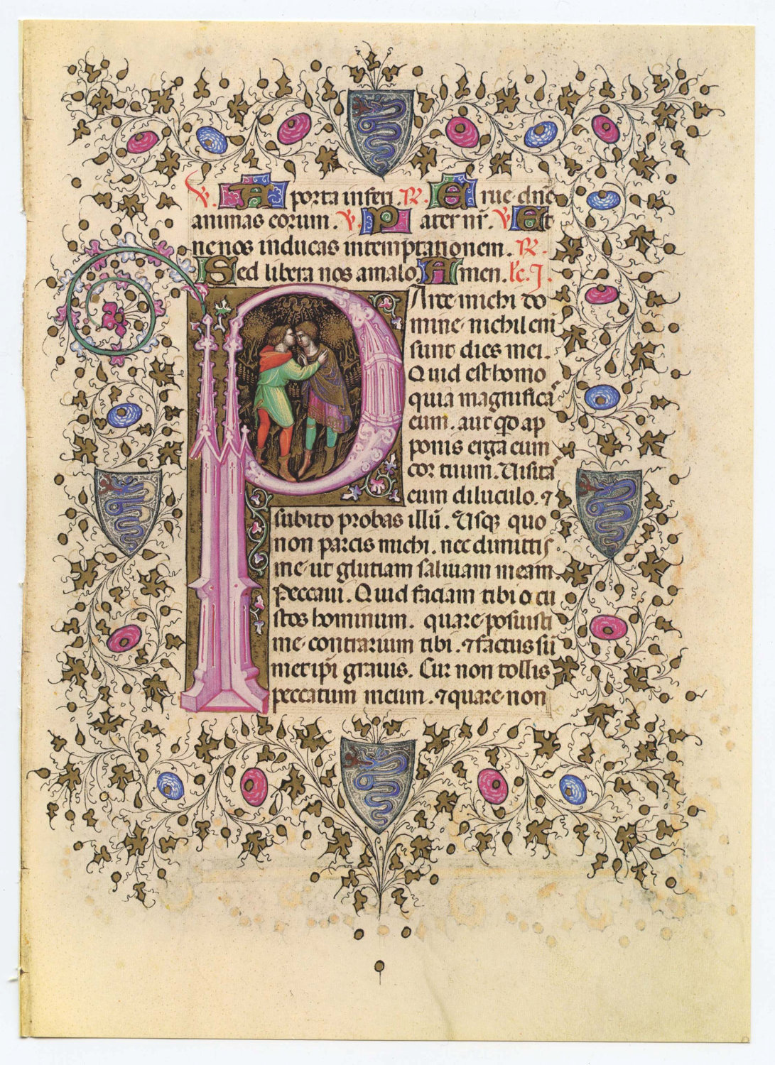
When I came along in the business, printing was about 500 years old, and over that half a millennium, publishers had learned a lot of craft and a lot of tricks.
They learned, to keep this really simple, how to set copy so it gets read. They learned techniques like having large-font-sentence leading into a copy block with smaller type to draw readers in. They understood that placing a caption underneath a picture was a way to get things read. They realized that things like side-bars and boxes within or alongside a column of type also increased readability.
They understood the importance of
widows
and short paragraphs.
All these tricks are lost on the new breed of copywriters and designers. All that knowledge, knowledge gained as I said over the course of five centuries seems to have disappeared. People write type and "set" type to fit. Not to have it read. And brevity, by the way, is not the only thing that leads to readability.
 | |
| This is hard to pass-over. |
Often I'm called in when there's a problem with a piece. I talk about it with young folks and I realize that they've never looked at type. They've read writing but never looked at it. If they have a bag of tricks it's holding nothing but dust.
No real point today. Except this. When you throw out the old, you throw out a lot.
 |
| A lot of type that invites you to browse. |
 |
| This was designed by Milton Glaser. There are a lot of words. A lot you want to read. |
 |
| This is by Tibor Kalman. Also eminently readable. |
 |
| There's a lot here to admire. |
No comments:
Post a Comment